
Signage is approved by people who already know the way
Wayfinding signage has a built-in evaluation problem: everyone who signs it off already knows where everything is. The design review checks brand, typography, and mounting, and never the only question that matters: does a first-time visitor, at this decision point, now choose correctly? That question is behavioral, and it is measurable with the venue's own flow data.
How do you measure whether wayfinding signage works?
By the decisions made after encountering it. Four behavioral metrics carry the evaluation: wrong-turn rate at the decision point the sign serves (journeys that head away from their eventual destination and correct later), backtrack rate (the signature of a missed or misread sign), decision dwell (how long journeys hesitate at the junction; good signage shortens it), and assistance demand (direction-asking at nearby staffed points, the metric staff feel first). All four are readable from anonymous journey data before and after a signage change.
The before/after method
Signage changes are placement experiments and inherit the discipline of signage A/B testing: baseline the four metrics at the decision point across comparable periods, change one thing (the sign, not the sign plus the lighting plus the floor graphics), then re-measure. Venues with continuous journey measurement get the baseline for free; venues without it commission observation studies per change, which is why the studies rarely happen and signage decisions revert to taste. The day-of-week traffic rhythm sets the comparison windows here as everywhere.
What the measurements keep revealing
Recurring findings from measured signage work: signs placed at the architect's sight lines rather than the visitor's approach path (visible from where nobody stands); overloaded junction signs that slow decisions rather than speed them (decision dwell rises after installation, the classic more-information-worse-outcome result); and missing confirmation signage, where visitors make the correct turn and then backtrack anyway because nothing confirmed they were still on route. The confirmation gap is invisible to design review and obvious in backtrack data.
Signage and digital guidance are one system
Signs handle the ambient load; kiosks and routes handle the specific question; each should be placed and evaluated with the other in view. A hesitation point can be fixed with a better sign, a better-placed kiosk, or a route link, and the flow data adjudicates which, per the kiosk-vs-static economics. Accessibility signage deserves the same measured treatment, per accessible wayfinding routes.
Where Ariadne fits
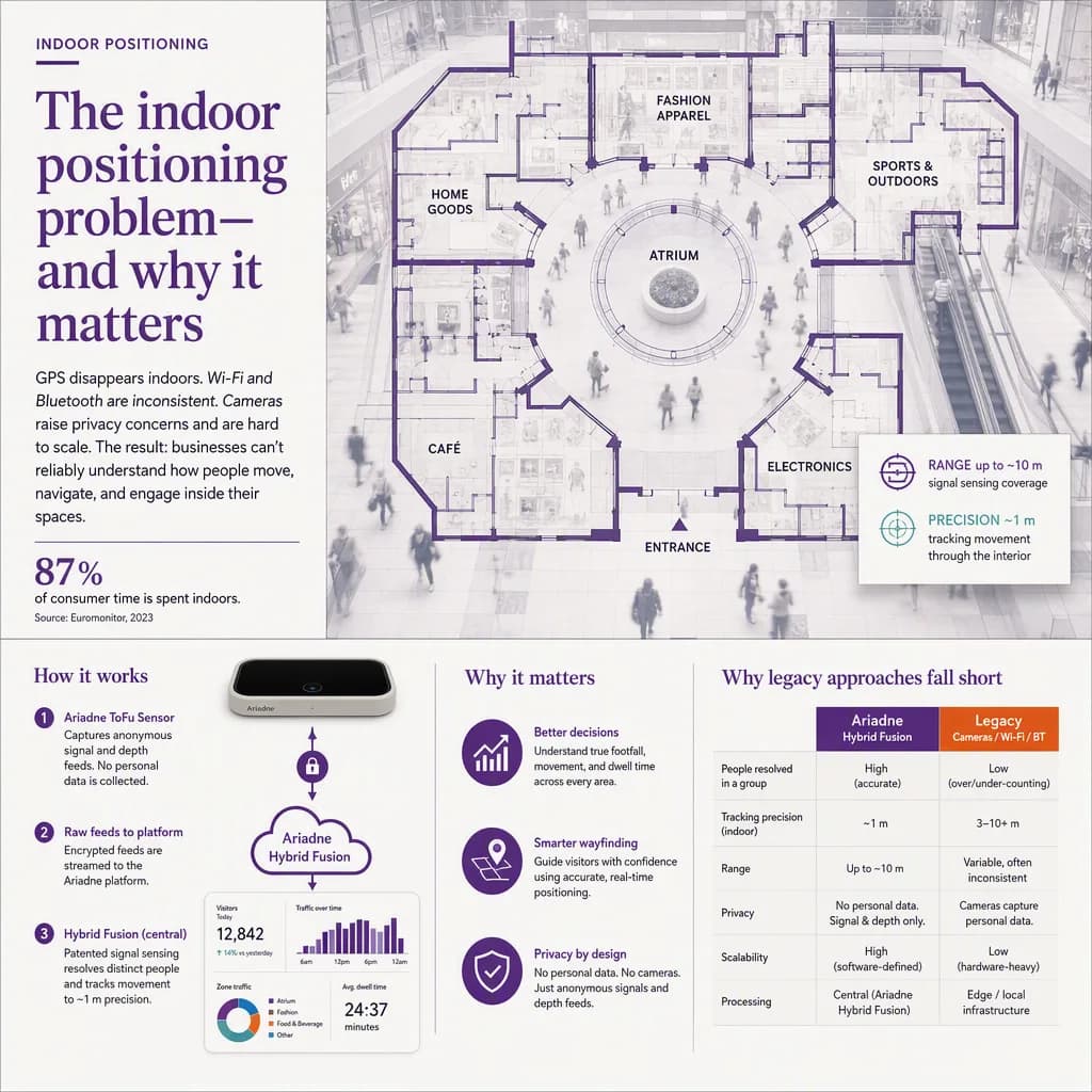
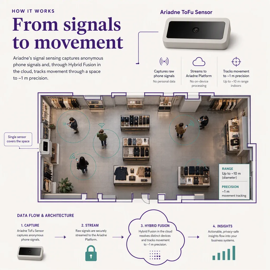
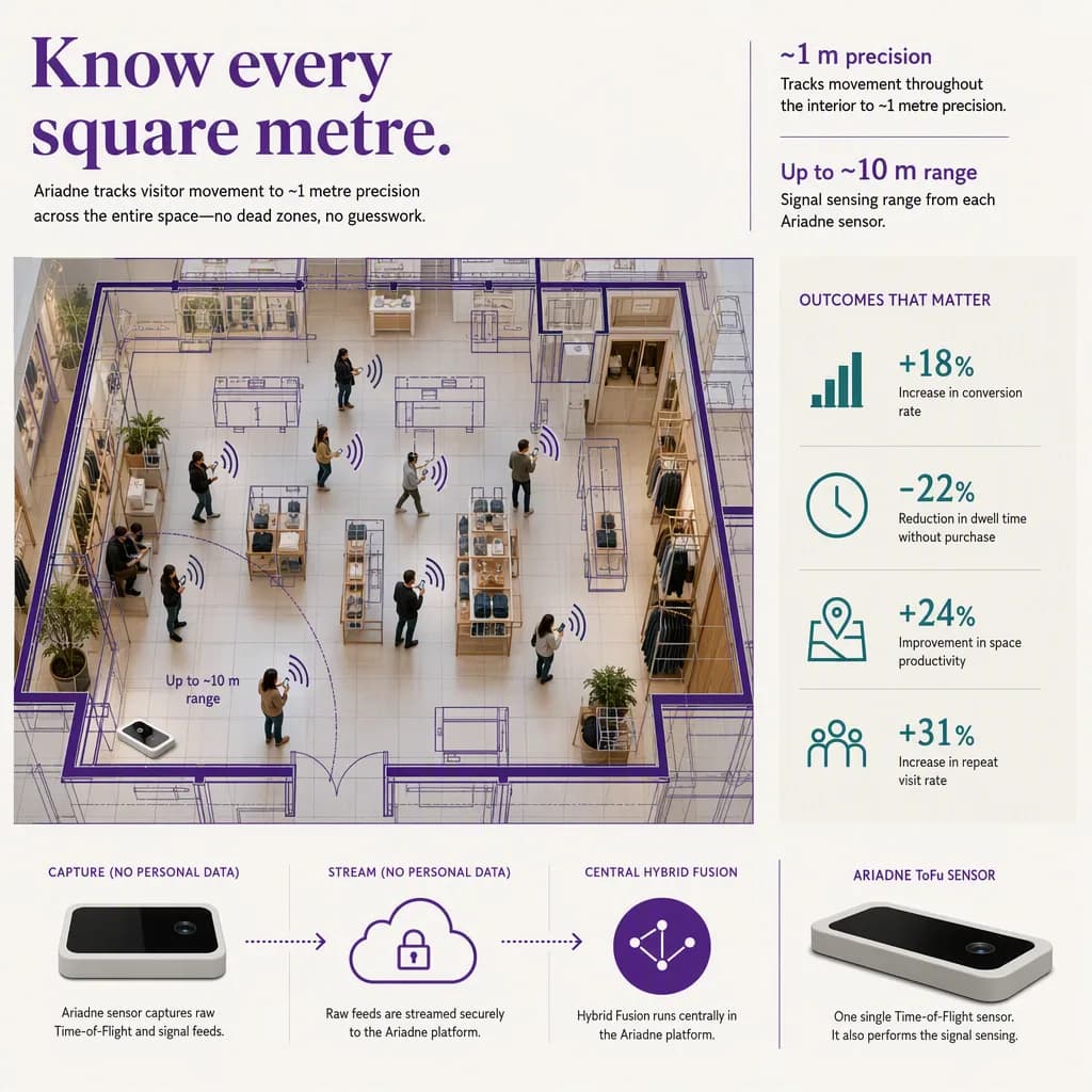
Ariadne's measurement layer produces exactly the four metrics above, continuously and camera-free, as anonymous journeys with dwell and paths, and its guidance layer closes the loop when signage alone cannot. The platform view is in the indoor navigation pillar.
---


