
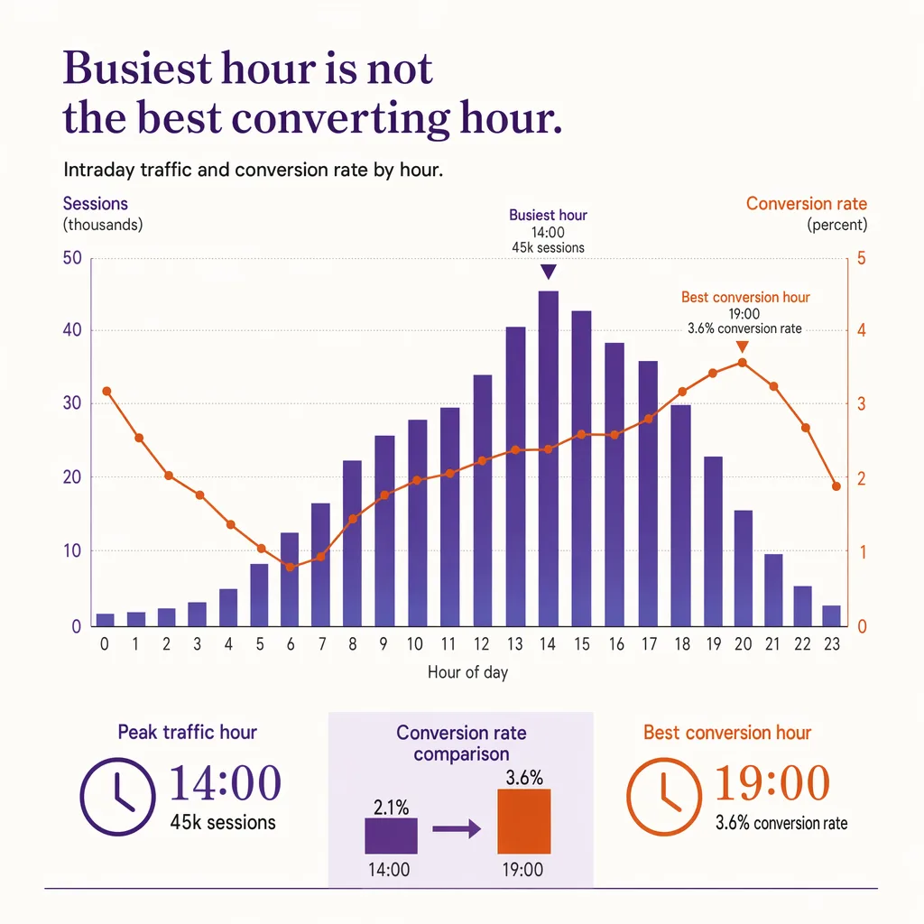
A daily conversion rate is one number standing in for a dozen very different hours. It averages the crowded lunch hour that converts poorly with the quiet mid-afternoon that converts well, and the single figure it produces describes neither. Any decision made off that average, staffing especially, is being made on a blur. Splitting conversion out by hour is what brings the day back into focus, and it routinely overturns the assumption that the busiest hour is the one that matters most.
This post applies conversion rate specifically to the hour dimension across the whole day, then reads the resulting curve for staffing and for diagnosing a slow patch. For the base metric itself, see the conversion rate formula; this post does not re-derive it. It also extends the lunch-hour traffic pattern from footfall alone into footfall plus conversion.
How does retail conversion rate vary by hour?
Conversion rate rarely holds flat across the day. A store can be busy at lunch with low-intent browsers and quiet mid-afternoon with high-intent buyers, so the hour with the most traffic is often not the hour with the best conversion. Plotting conversion by hour separates crowded-but-low-converting periods from quiet-but-high-converting ones, which is exactly what a daily total hides. The two most common uses are staffing (put your strongest coverage on the highest-value converting hours, not just the busiest ones) and diagnosing a slow patch. It needs hourly entries and hourly transactions aligned to the same clock.
Why the busiest hour is often not the best-converting hour
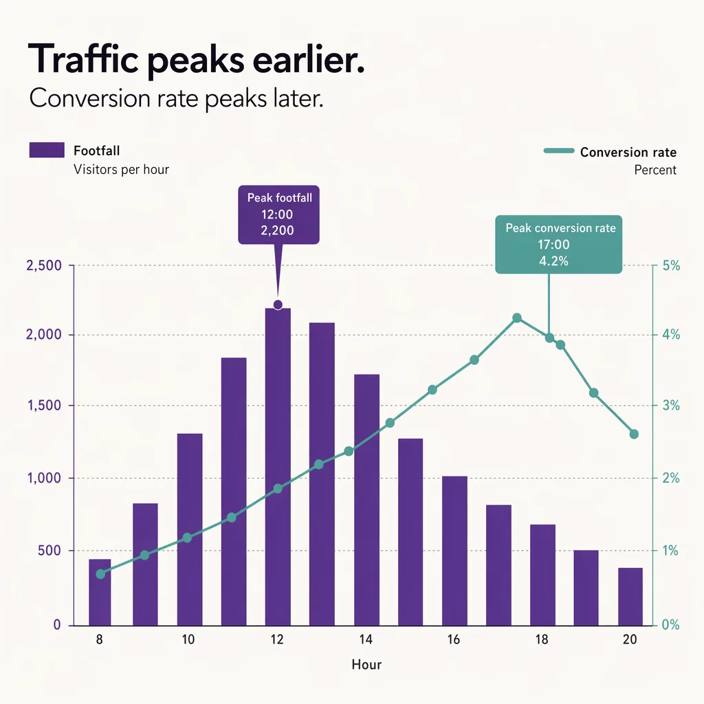
Traffic and intent are not the same thing, and they peak at different times. The lunch hour is the clearest example: a store near offices fills with people on a break who are browsing, comparing, or killing time, and only a fraction arrive intending to buy. The store is at its busiest and its conversion rate is often at its lowest. A quiet weekday mid-afternoon can be the reverse, fewer people through the door but a higher share of them there deliberately, which lifts conversion even as the raw count falls.
This is why traffic quality has to be read alongside traffic volume. A busy hour that converts poorly is not a failure on its own; it may be doing exactly what a lunchtime crowd does. The mistake is treating volume as a proxy for value and pouring resources into the busiest hour when the highest-value hour is somewhere else on the clock. The only way to tell them apart is to plot conversion by hour and look at where the two curves, traffic and conversion, actually line up and where they diverge.
Building the curve: hourly entries divided by hourly transactions, aligned to one clock
The hourly conversion curve is simple to define and easy to get wrong. For each hour of trading, conversion is transactions in that hour divided by entries in that hour, expressed as a percentage. Plot those hourly figures across the day and the curve is the shape you read.
The part that breaks most attempts is alignment. Entries and transactions have to sit on the same clock and the same hour boundaries, or the ratio is meaningless. If the point-of-sale system logs a transaction at the moment of payment while a visitor entered fifteen minutes earlier, a strict hour-by-hour split will misattribute some sales to the wrong hour, and the effect is largest exactly at the busy transitions you most want to read. Practically, that means using consistent hour buckets on both feeds and being aware that the boundary hours carry the most noise. The formula is the easy half; getting two data sources onto one honest timeline is the half that decides whether the curve is trustworthy.
What the shape tells you: lunch dip, late-afternoon peak, opening and closing tails
Once the curve is built, its shape is the message. The patterns below are typical shapes described illustratively, not measured benchmarks; real curves vary by format, location, and day.
- The lunch dip. Traffic climbs into midday while conversion sags, the browser-heavy pattern described above. The gap between a high traffic bar and a low conversion line at lunch is often the widest of the day.
- The late-afternoon or early-evening peak. In many stores conversion firms up later in the day as purpose-driven shoppers arrive after work, sometimes on lower traffic than lunch. This is frequently the highest-value hour and the one that gets under-resourced when staffing follows the traffic curve instead.
- The opening tail. The first hour can show thin traffic but high conversion, early shoppers tend to be deliberate, or it can show noise simply because the denominator is small. Read the opening hour with the entry count in mind.
- The closing tail. Conversion sometimes rises near closing as remaining shoppers are the committed ones and browsers have left, though a hard close can also cut off transactions that would otherwise complete. Interpret the last hour against store policy.
Day of week shifts all of this. A Saturday curve is not a Tuesday curve, and averaging them flattens both. Read the hourly curve within a day type, not across the week, and pair it with day-of-week footfall patterns so the hour and the day are read together rather than blurred into a single average.
Staffing to the conversion curve, not just the traffic curve
The practical payoff of the hourly curve is staffing. The default habit is to schedule the most people during the busiest hours, which sounds sensible and quietly wastes coverage. If the busiest hour is a low-converting browser peak and the highest-converting hour is a quieter block later on, staffing to traffic puts the strongest coverage where it converts least and thins it out exactly when a good associate would tip an on-the-fence shopper into a purchase.
Staffing to the conversion curve means weighting coverage toward the hours where an extra pair of hands turns intent into a sale, not just the hours with the most bodies. That does not mean abandoning the busy hours, a lunch crowd still needs enough staff to keep queues down and prevent the crowding from suppressing conversion further, which is its own reason to watch coverage. It means the schedule is built from two curves rather than one. For the staffing ratio side of this, see staffing to the traffic curve, and for turning these patterns into a repeatable roster, demand-based scheduling.
Getting hourly entries accurate enough to trust the curve
An hourly conversion curve is only as good as its denominator. Transactions come from the point-of-sale system and are generally reliable to the minute. Entries are the weaker link, and any error in the hourly entry count feeds straight into the conversion figure for that hour. A door counter that miscounts groups, double-counts staff, or drifts out of calibration will distort the exact intraday shape the curve exists to reveal, and because the error is per-hour rather than smoothed over a day, it can invent a dip or hide a peak.
Ariadne measures this with Hybrid Fusion, its patented camera-free method. Time-of-Flight depth sensing counts every visitor at the entrances, capturing geometry rather than images, while patented phone signal sensing follows movement through the interior, detecting the signals a phone emits even in airplane mode, and tracks that movement to about one-metre precision. The sensor streams both feeds to Ariadne, where Hybrid Fusion combines them into one trajectory per visit and computes counts, dwell, and paths. The streams carry no identifier: no MAC address, no device ID, no biometric data, and no camera is involved. Identifiers are stored only when a visitor explicitly opts in, which keeps the method GDPR-friendly and outside biometric territory.
For the hourly curve, the point is a calibrated, consistent entry count in every hour bucket, so the conversion figure for the lunch dip and the evening peak reflects real shopper behavior rather than a counting artifact. Get the denominator right and the curve becomes something you can staff to and diagnose from. Get it wrong and every hourly decision inherits the error. For the counting method behind that, see hourly people counting.
FAQ
How does retail conversion rate vary by hour?
It rarely holds flat. A store can be busiest at lunch with low-intent browsers and quieter mid-afternoon with high-intent buyers, so the hour with the most traffic is often not the hour with the best conversion. Plotting conversion by hour separates crowded-but-low-converting periods from quiet-but-high-converting ones.
How do I calculate conversion rate by hour?
For each trading hour, divide transactions in that hour by entries in that hour, expressed as a percentage, then plot those figures across the day. The critical step is aligning entries and transactions to the same clock and hour boundaries, because a mismatch misattributes sales and distorts the curve most at the busy transitions.
Which hour has the best conversion rate?
It varies by store, but in many retailers the late-afternoon or early-evening block converts best as purpose-driven shoppers arrive, often on lower traffic than the lunch peak. There is no universal answer, which is exactly why the curve is worth building for a specific store rather than assumed.
Should I staff to the busiest hour or the best-converting hour?
To both, weighted by the conversion curve rather than the traffic curve alone. Busy hours still need enough coverage to keep queues down, but the highest-converting hours are where an extra associate most often turns intent into a sale, and they are frequently under-resourced when staffing follows traffic volume.
Do I need cameras to measure hourly conversion?
No. Ariadne counts with Hybrid Fusion: Time-of-Flight depth sensing plus patented phone signal sensing, never cameras. Time-of-Flight captures geometry rather than images, and signal sensing captures no MAC address by default, so the measurement involves no video, no faces, and no biometric data.