A wayfinding kiosk earns its keep in the few seconds a visitor gives it. Someone steps off an escalator, scans the space, and either finds the screen and gets a clear answer or gives up and looks for a member of staff. Designing a good kiosk is the work of making those seconds pay off: the right hardware in the right spot, a map that orients itself to the person standing in front of it, and an interface a wheelchair user or a first-time visitor can operate without asking for help.

This guide treats the kiosk as a design object, from the screen and the mount to the map UX, placement, and accessibility, and it closes on how footfall data tells you where a kiosk actually belongs. For the broader picture of how indoor wayfinding works, start with the pillar. This post assumes you are past the fundamentals and designing the physical touchpoint itself.
What makes a good wayfinding kiosk?
A good wayfinding kiosk answers "where am I and how do I get there" in a few seconds, from where people naturally pause and look for direction. That means placing it at decision points (entrances, atria, junctions) with clear sightlines, keeping the map oriented to the way the viewer faces, showing a small set of high-value destinations rather than an exhaustive list, and meeting accessibility needs like reachable touch height and screen-reader support. The best placement decisions are grounded in where footfall actually concentrates and hesitates, not guesswork.
The rest of this post takes each of those pieces in turn, because a kiosk fails at any one of them: perfect hardware in the wrong spot is ignored, a great location with a confusing map sends people the wrong way, and an elegant interface a wheelchair user cannot reach is a compliance problem waiting to surface.
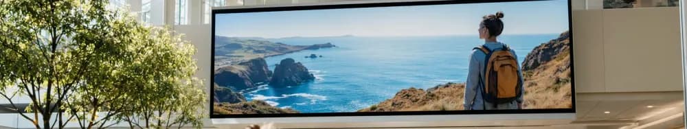
Hardware and screen: size, orientation, touch, and durability for a public space
The hardware decisions start with viewing distance. A kiosk read from arm's length can use a smaller portrait screen; one that also has to catch attention across a busy atrium needs a larger display and enough brightness to stay legible under skylights and downlights. Public spaces run bright, so a screen specified for an office will wash out under a mall roof or an airport curtain wall. Match the panel brightness to the actual lighting of the spot, not to a datasheet read in a dim showroom.
Orientation follows the content. Portrait suits a single-column list of destinations and a tall map; landscape suits a wide floor plan or a multi-floor stack shown side by side. Freestanding pedestals work at open decision points; wall-mounted and recessed units suit corridors where a pedestal would obstruct flow or block an accessible path.
Touch and durability are where public kiosks differ most from consumer screens. A kiosk touched thousands of times a day needs a hardened surface, an anti-glare and anti-fingerprint finish, and a bezel that resists knocks from trolleys and luggage. Projected-capacitive touch through toughened glass is the common choice for that duty, though the exact panel spec depends on the venue. Ariadne does not sell kiosks, so treat any hardware figure here as a general design consideration and specify against a real product sheet before you buy.
Map and content UX: "you are here" orientation, destination hierarchy, route clarity
The single most important interaction rule for a fixed kiosk is heading-up orientation: the map should be rotated so that "up" on the screen matches the direction the viewer is facing. A north-up map forces the reader to do mental rotation, which is exactly the error that sends people the wrong way out of the gate. Because the kiosk is bolted in a known spot facing a known direction, you can set this correctly once, which is an advantage a handheld map does not have.
Destination hierarchy is the next discipline. A directory that lists everything alphabetically buries the destinations most people actually want. Lead with a short set of high-value and high-search destinations (restrooms, exits, the information desk, the top few named tenants or departments) and let everything else sit behind search or a category. A visitor at a kiosk is usually mid-journey and impatient, so the first screen should resolve the common cases without a tap.
Route clarity closes the loop. Once a destination is chosen, the kiosk should show a single clear path with a small number of turn cues and an honest estimate of walk time or distance, not a dense web of every possible route. If the venue has multiple floors, the route has to make the level change explicit: which lift or stairway, and where the visitor rejoins the map on the next floor. For how destinations are chosen and positioned so they get found in the first place, see where to place a directory.
Placement and sightlines: decision points, entrances, and junctions
A kiosk works where people already stop to make a decision. Those decision points are predictable: the main entrance, where a first-time visitor arrives with no bearings; atria and concourses, where several routes meet; and major junctions, where a corridor splits and the visitor has to choose. Placing a kiosk mid-corridor, between decisions, wastes it, because nobody is looking for direction there.
Sightlines decide whether the kiosk gets used at all. It needs to be visible from the approach, far enough back that a small crowd around it does not spill into the main flow, and lit so it reads as a destination rather than disappearing into signage clutter. A kiosk tucked behind a pillar or facing away from the arrival direction may as well not exist.
Two venue types make the placement logic vivid. In a hospital, the anxious first-time outpatient arriving for an appointment is the priority user, so the kiosk belongs at the entrance and at the junction where clinics branch, not deep inside a department. At an arena, the pressure is a surge of thousands arriving in a short window, so kiosks have to sit at concourse decision points and be legible to people moving in a dense stream, not standing still. The right placement is specific to how each venue's crowd arrives and where it hesitates.
Accessibility at the kiosk: reach height, contrast, screen reader, and a step-free approach
Accessibility is a design requirement, not a finishing touch. A kiosk that a standing adult can use easily may be unusable from a wheelchair if the interactive elements sit too high or the screen tilts the wrong way. Reachable touch height, a viewing angle that works seated and standing, and clear knee and toe clearance at a freestanding unit are the baseline. Confirm the specific reach and clearance figures against the accessibility standard that applies in your jurisdiction rather than a remembered number.
The interface has its own accessibility layer. High contrast between text and background, type large enough to read without leaning in, and touch targets big enough for limited dexterity all matter. A screen-reader or audio-output mode, and a physical or on-screen control that a visitor with low vision can find, extend the kiosk to people who cannot use a purely visual map. Support for more than one language matters in venues with international traffic.
The approach to the kiosk is part of its accessibility. A kiosk reachable only by stepping up onto a plinth, or sited where a wheelchair cannot pull alongside, defeats its own interface. The physical route to the screen has to be step-free, which connects kiosk design directly to route design; see accessible wayfinding routes for how the step-free path itself is planned and mapped.
Kiosk vs mobile wayfinding: when to use each, and how they complement
Fixed kiosks and mobile wayfinding are not competitors so much as different tools for different moments. A kiosk is always available to any visitor without an app, install, or account, which makes it the reliable option for the first-time or one-off visitor. A phone knows where its owner is and can route them turn by turn as they walk, which a fixed screen cannot. Most mature venues run both, and the design question is which does which job.
| Factor | Fixed wayfinding kiosk | Mobile wayfinding |
|---|---|---|
| Availability | Instant, no app or account needed | Requires a phone, and often an app or web link |
| Positioning | Fixed known point ("you are here" is set once) | Follows the visitor as they move, if positioning is available |
| Guidance style | Static route from the kiosk's location | Turn-by-turn along the walk |
| Reach | Every passer-by, including non-smartphone users | Only visitors who open it |
| Accessibility | Built once to standard, shared by all | Uses the phone's own accessibility features |
| Upkeep | Physical maintenance, cleaning, hardware faults | Content updates ship remotely |
| Best for | First-time visitors, arrival and decision points | Longer or repeat journeys, personalised routing |
The two complement each other cleanly. The kiosk catches the arriving visitor and answers the immediate question; a mobile handoff (a scannable code that opens the same route on the phone) carries the journey the rest of the way. Designed together, the kiosk becomes the entry point and the phone becomes the walking companion.
Placing kiosks where footfall data says visitors decide
The placement principles above tell you where kiosks should go in theory. Footfall data tells you whether the theory holds in your specific building. Where do people actually pause and look around? Which junction produces the most hesitation and the most wrong turns? A venue can put a kiosk at the entrance it assumed was busiest and later find that most visitors arrive through a side entrance the kiosk never faced. Measurement replaces that assumption with a count.
Ariadne measures this with Hybrid Fusion, its patented camera-free method. Time-of-Flight depth sensing counts every visitor at the entrances, capturing geometry rather than images, while patented phone signal sensing follows movement through the interior, detecting the signals a phone emits even in airplane mode, and tracks that movement to about one-metre precision. The sensor streams both feeds to Ariadne, where Hybrid Fusion combines them into one trajectory per visit and computes counts, dwell, and paths. The streams carry no identifier: no MAC address, no device ID, no biometric data, and no camera is involved. Identifiers are stored only when a visitor explicitly opts in, which keeps the method GDPR-friendly and outside biometric territory.
Read against kiosk placement, that gives a facilities or experience team the two things guesswork cannot: where visitors concentrate on arrival, and where they slow down or double back, which is the signature of a place people need direction. Ariadne does not sell kiosks or design the map; it measures the flow that tells you where a kiosk will be seen and used. See Ariadne indoor navigation for how that measurement supports wayfinding across a venue.
FAQ
Where should a wayfinding kiosk be placed?
At decision points: the main entrance, atria and concourses where routes meet, and major junctions where a corridor splits. It needs clear sightlines from the approach and enough space around it that a small crowd does not block the main flow. Footfall data helps confirm which of those points visitors actually use.
Should a wayfinding kiosk map be north-up or heading-up?
Heading-up. The map should be rotated so "up" on the screen matches the direction the viewer faces. Because a kiosk is fixed in a known spot facing a known direction, you can set this correctly once, which avoids the mental rotation that sends people the wrong way from a north-up map.
How do I make a wayfinding kiosk accessible?
Set interactive elements at a reachable touch height with knee and toe clearance for seated users, use high contrast and large type, offer a screen-reader or audio mode and more than one language, and make sure the physical approach to the kiosk is step-free. Confirm reach and clearance figures against the accessibility standard for your jurisdiction.
Do I still need kiosks if I have a mobile wayfinding app?
Usually yes. A kiosk serves every passer-by with no app or account and is the reliable option for first-time and one-off visitors, while a mobile app gives turn-by-turn guidance to those who open it. Most venues run both and design a handoff so the kiosk starts the journey and the phone continues it.
Does measuring footfall around a kiosk require cameras?
No. Ariadne counts with Hybrid Fusion: Time-of-Flight depth sensing plus patented phone signal sensing, never cameras. Time-of-Flight captures geometry rather than images, and signal sensing captures no MAC address by default, so the measurement involves no video, no faces, and no biometric data.

---