Most airport-operations content treats capacity as a single number: how many passengers a terminal can handle in a year. That figure is useful for headlines and almost useless for planning. A terminal does not fail at its annual total. It fails at a specific processor, in a specific half-hour, when the arrival curve for that window overwhelms the check-in desks, the security lanes, immigration, or the gate hold rooms. Terminal capacity planning is the discipline of matching each of those processors to the passenger volume it must handle at the busy periods that actually test it, against a defined standard for wait and crowding.
This post sits a level above the point solutions the rest of the airport cluster covers. Where predicting passenger queues handles one processor and gate dwell time handles one zone, capacity planning is the cross-zone view that decides where the terminal will break first and what to do about it. It assumes you already understand how airports count passengers and want to know how the counts turn into a plan. Throughout, treat footfall data as a planning input that sharpens the model, not as a certified capacity or safety system.
How do airports use footfall data for terminal capacity planning?
Terminal capacity planning matches the terminal's processors, check-in, security, immigration, and the gates, to the passenger volume they must handle at the design peak, against a level-of-service target for wait and crowding. Traditionally that peak is modelled from flight schedules and load-factor assumptions. Measured footfall improves it by replacing assumptions with the actual arrival curve, zone by zone: how passengers really distribute across the day, where crowding builds first, and which processor becomes the bottleneck as volumes grow. Planning from measured flow tells an airport whether it has a capacity problem or a scheduling problem, and where to invest before the peak overwhelms a zone.
The sections below walk the framework, then the shift from a modelled peak to a measured one, then how to read a terminal as a chain of processors where a jam in one zone reshapes the next.
Level of service and the design peak: the framework capacity planning works from
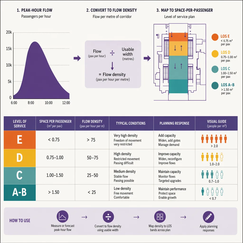
Capacity planning does not ask "how many people fit." It asks "how many people fit at an acceptable standard of comfort and wait." That standard is what the industry calls level of service. The recognised reference for it is IATA's guidance in the Airport Development Reference Manual, which frames level of service around the space allocated per passenger and the time spent waiting in each zone, rather than a raw headcount. The practical point for planners is the shape of the idea, not a specific published band: a terminal has an intended experience, and capacity is defined relative to holding that experience, not to the moment the building physically cannot admit another person.
The second half of the framework is the design peak. No terminal is built for its annual average, because the average never shows up at a desk. It is built for a busy period, a representative peak hour or peak half-hour that the terminal is expected to serve at the target level of service. Choosing that design period is a judgement: build to the single worst hour of the year and the terminal sits half empty most days; build to the average and it fails routinely. The design peak is the deliberate line between those two, and it is the number every processor is then sized against.
Once level of service and the design peak are set, each processor gets a required capacity: enough check-in positions, security lanes, immigration booths, and gate seating to serve the design-peak arrival curve within the wait and space targets. The whole exercise is only as good as the arrival curve it assumes, which is exactly where measurement earns its place.
Modelled peak vs measured peak: what actual flow data changes
For decades the design-peak arrival curve has been modelled. Planners take the flight schedule, apply assumed load factors, apply assumed show-up profiles (how early passengers arrive before departure), and derive an expected flow into each processor. The model is reasonable, and it is also a stack of assumptions, each of which can drift from reality. Show-up behaviour changes with route mix, with the balance of business and leisure travel, and with how much passengers trust the airport not to make them wait. A curve modelled on last decade's behaviour can misplace the peak by a wide margin.
Measured footfall replaces the weakest of those assumptions with observation. Instead of assuming when passengers show up, the airport can see the arrival curve it actually produces, zone by zone and hour by hour, across many days. That changes three things in the plan. It corrects the shape of the peak, so the design period reflects real behaviour rather than a modelled profile. It exposes distribution the model smooths over, such as a mid-morning surge that the schedule alone would not predict because it comes from passengers arriving unusually early for a cluster of long-haul departures. And it lets a planner validate the model itself: if measured flow and modelled flow disagree, that gap is the first thing worth understanding before a single euro is committed to new capacity.
Measured flow does not remove the need to model, because planning is about the future and the future is not yet measured. What it does is anchor the model in observed behaviour, so the forecast for next year's peak starts from what this year's terminal actually did rather than from a decade-old show-up assumption. Any specific throughput or passenger-volume figure a planner cites should come from the airport's own measured record or a named public source, not from a rule of thumb dressed up as a standard.
Finding the bottleneck processor as volumes grow
A terminal is a chain: curb, check-in, security, then either immigration and gates for departures or the arrivals path in the other direction. Capacity is set by the weakest link at the design peak, and the weakest link is rarely obvious from the annual numbers. Two terminals with identical throughput can have completely different bottlenecks depending on route mix, self-service adoption, and how the schedule banks flights.
Measured flow lets a planner locate the current bottleneck and, more valuably, predict where the next one appears as volumes rise. Suppose security clears the design peak comfortably today. Add a few percent of passenger growth and model it against measured lane throughput, and security may still hold while immigration, sized for today's arrivals mix, tips over first. Or the reverse. The point of planning from measured flow is to answer that question before the growth arrives, so investment lands on the processor that will actually constrain the terminal rather than on the one that feels busiest to walk through. Queue prediction covers a single processor in depth; capacity planning is the layer that decides which processor deserves that attention first.
There is a discipline to reading bottlenecks: never confuse a busy processor with a constrained one. A security hall can look packed and still be clearing passengers within target, while a quieter immigration hall two zones later is the one blowing the level-of-service standard. The busy-looking zone draws the eye; the measured wait tells the truth, and capacity planning has to work from the measured wait.
Cross-zone flow: how crowding in one zone cascades
Processors do not fail in isolation. When one zone backs up, it reshapes the flow into the next, and a terminal that is modelled zone by zone can miss the interaction that actually causes the bad day. A slow security hall does not just create a queue at security. It holds passengers back, then releases them in a compressed burst once lanes catch up, and that burst hits the gates and the airside concessions harder than any independent model of the gates would predict.
The same cascade runs the other way. Generous processing upstream can push a wave of passengers airside earlier than the gate hold rooms and the concourse were sized for, turning a security win into a gate dwell time and crowding problem. This is why capacity planning has to look at the terminal as a connected system and not as a row of separate desks. A change that relieves one processor can load another, and only cross-zone flow measurement shows the second-order effect before it becomes a complaint.
Reading the terminal this way also changes how an airport evaluates an intervention. Open more security lanes and the queue shrinks, which looks like an unambiguous win, until you measure the downstream zones and ask whether the relieved flow simply moved the crowd to the gates. Cross-zone measurement is what turns a local fix into a defensible plan for the whole building.
Capacity problem vs scheduling problem: what the data tells you to fix
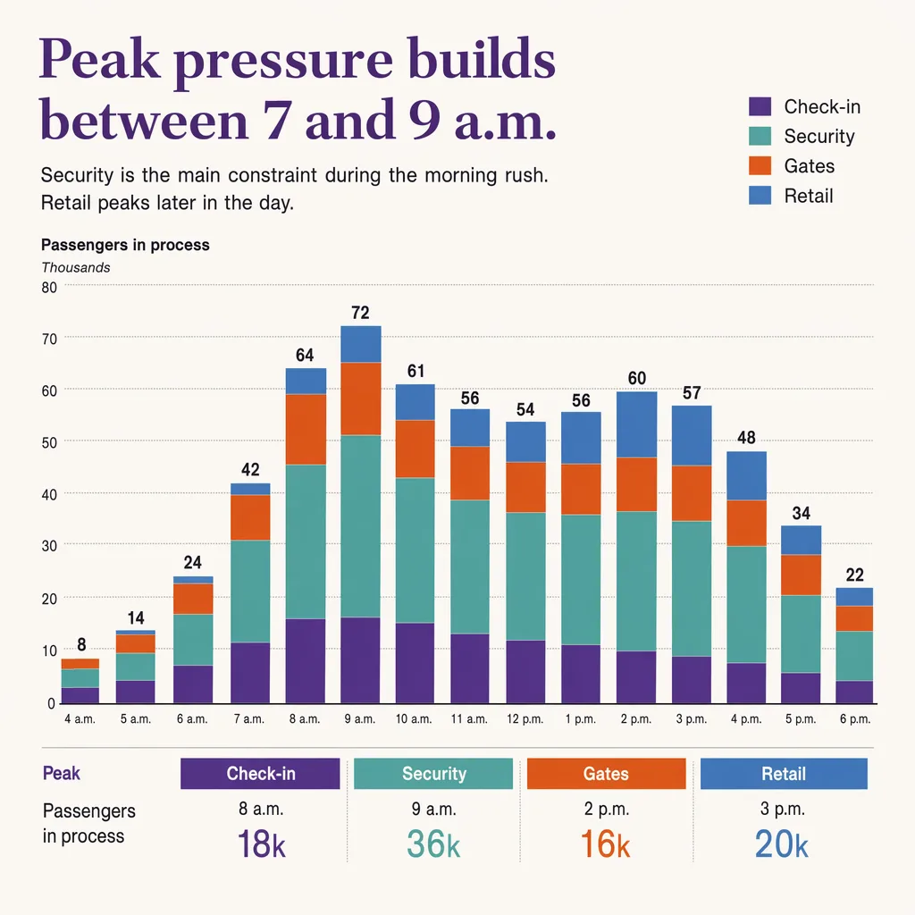
The most valuable thing measured flow does for a planner is separate two problems that look identical from inside a queue. A terminal that overwhelms its security hall every morning has one of two conditions. Either it genuinely lacks the processing capacity for the volume it serves (a capacity problem, solved with more lanes, more space, or more positions), or it has adequate capacity that the flight schedule banks into peaks the processors cannot smooth (a scheduling problem, solved by spreading the schedule or the show-up profile, not by pouring concrete).
The two call for opposite responses, and getting the diagnosis wrong is expensive. Build lanes for a scheduling problem and the new capacity sits idle for most of the day while the peak still bites, because the peak was never about total capacity. Reschedule around a genuine capacity problem and the terminal keeps failing because there was never enough processing to begin with. Measured flow across the day is what distinguishes them: a capacity problem shows sustained pressure against the processor's limit, while a scheduling problem shows sharp peaks against long troughs, the classic signature of a schedule that banks arrivals into windows the terminal cannot serve smoothly.
This is also the diagnosis that justifies or kills a capital case. A proposal to expand a processor should rest on measured evidence that the constraint is capacity and not scheduling, and that the expansion targets the processor that will actually bind as volumes grow. Planning from measured flow does not make that decision for the airport. It gives the decision an evidentiary base instead of an anecdotal one.
How Ariadne measures terminal-wide flow
Capacity planning needs flow measured consistently across every zone, over long enough to establish a real arrival curve, and in spaces where cameras are not acceptable. That last constraint is exactly where Ariadne fits.
Ariadne measures this with Hybrid Fusion, its patented camera-free method. Time-of-Flight depth sensing counts every visitor at the entrances, capturing geometry rather than images, while patented phone signal sensing follows movement through the interior, detecting the signals a phone emits even in airplane mode, and tracks that movement to about one-metre precision. The sensor streams both feeds to Ariadne, where Hybrid Fusion combines them into one trajectory per visit and computes counts, dwell, and paths. The streams carry no identifier: no MAC address, no device ID, no biometric data, and no camera is involved. Identifiers are stored only when a visitor explicitly opts in, which keeps the method GDPR-friendly and outside biometric territory.
For a capacity planner, that produces the input the whole exercise depends on: the actual arrival curve at each processor and the flow between zones, measured the same way everywhere so the numbers are comparable across the terminal and across time. It is a planning input, not a certified capacity or safety system, and it should sit alongside the flight schedule, the level-of-service framework, and the airport's own judgement rather than replacing them. For how the same measurement supports the point-solution decisions beneath the plan, see airport analytics, and for the sensing method in more depth, people counting.
Related reading
FAQ
Do I need cameras to measure terminal flow for capacity planning?
No. Ariadne counts with Hybrid Fusion: Time-of-Flight depth sensing plus patented phone signal sensing, never cameras. Time-of-Flight captures geometry rather than images, and signal sensing captures no MAC address by default, so the measurement involves no video, no faces, and no biometric data.
What is level of service in airport terminal capacity planning?
Level of service is the standard a terminal is planned to hold, framed around the space allocated per passenger and the time spent waiting in each zone rather than a raw headcount. The recognised reference is IATA's guidance in the Airport Development Reference Manual. Capacity is defined relative to holding that standard, not to the point where the building physically cannot admit anyone else.
What is the design peak, and why not plan for the annual total?
The design peak is a representative busy period, a peak hour or half-hour, that the terminal is built to serve at the target level of service. Airports plan to it rather than to the annual total because a terminal never fails at its yearly average; it fails at a specific processor in a specific window when that period's arrival curve exceeds what the processor can clear.
How does footfall data improve a capacity plan?
It replaces the weakest modelled assumption, when passengers actually show up, with the observed arrival curve, zone by zone across many days. That corrects the shape of the peak, exposes surges the schedule alone would miss, and lets a planner validate the model. Any specific volume or throughput figure should come from the airport's measured record or a named public source, not a rule of thumb.
Does measured flow replace flight-schedule modelling?
No. Planning is about the future, so modelling stays necessary. Measured flow anchors the model in observed behaviour, so next year's forecast starts from what the terminal actually did this year rather than from an old show-up assumption. It is a planning input that sharpens the model, not a certified system that replaces it.
How do you tell a capacity problem from a scheduling problem?
By reading measured flow across the whole day. A capacity problem shows sustained pressure against a processor's limit, so more lanes, positions, or space is the fix. A scheduling problem shows sharp peaks against long troughs, the signature of a schedule that banks arrivals into windows the terminal cannot smooth, so spreading the schedule fixes it. Building capacity for a scheduling problem leaves expensive processing idle most of the day.


